If you’re looking for some inspiration for your own restaurant website, or just want to see what the best in the industry are doing, you’ve come to the right place.
In this article, we’ll show you 8 restaurant websites that are not only visually appealing, but also functional, informative, and engaging.
These restaurant websites showcase their menus, locations, online ordering options, and more in a way that makes you want to visit them as soon as possible.
Let’s take a look at these mouth-watering examples of restaurant websites.
1. Girl & the Goat – Chicago, Illinois
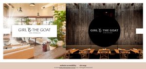
Girl & the Goat is a popular restaurant in Chicago that serves innovative dishes with global influences.
Their website features a sleek side navigation bar with all the relevant information and links laid out in an easy-to-navigate order.
The homepage also displays a stunning video of their food and atmosphere, along with a catchy slogan: “Come hungry. Leave happy.”
The website also allows you to make reservations, order online, buy gift cards, and join their mailing list.
2. El Catrin – New York City, New York
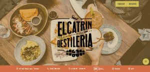
El Catrin is a Mexican restaurant in New York City that offers authentic cuisine and cocktails in a vibrant and colorful setting.
Their website uses a playful theme along with subtle on-scroll animation effects and a beautiful color scheme to grab the attention of their visitors. The website also features hero sliders, stylistic typography, and easy-to-locate CTAs that make it easy for customers to view their menu, order online, book a table, or contact them.
3. Adachi – Birmingham, Michigan
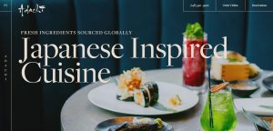
Adachi is a Japanese restaurant in Michigan that specializes in sushi and robata grill.
Their website features elegant typography, breathtaking animations, and stunning food photography that showcase their quality and creativity.
The website also provides an excellent user experience by making ordering, reservations, and purchasing effortless on the website, thanks to the conspicuous CTA buttons included in the design.
4. PHO – London, United Kingdom
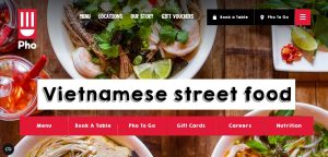
PHO is a Vietnamese restaurant chain in London that serves fresh and healthy food in a casual and cozy environment.
Their website features high-quality food images as the site background, along with customized icons and CTA buttons.
Navigation is super easy, thanks to the helpful sticky menu included in the website design.
The website also has a Parallax Effect that creates a unique experience as you scroll through the pages.
5. Bianca Restaurant – Berlin, Germany
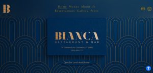
Bianca Restaurant is a modern Italian restaurant in Berlin that offers seasonal and regional dishes with a twist.
Their website uses a minimal web design with abundant use of white space background along with colorful and stylish typography.
The website features a unique full-screen design that supports the creative display of text and illustrations for easy content digestion.
The website also allows you to view their menu, make reservations, order online, or contact them.
6. Tiki Chick – New York City, New York
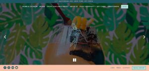
Tiki Chick is a tropical-themed bar and restaurant in New York City that serves Polynesian-inspired food and drinks.
Their website uses a fun and quirky design that reflects their personality and vibe. The website features bright colors, retro fonts, animated graphics, and catchy slogans that make you feel like you’re on vacation.
The website also lets you explore their menu, order online, book an event, or join their club.
7. The Aviary – Chicago, Illinois

The Aviary is an award-winning cocktail bar and restaurant in Chicago that offers inventive drinks and food in an upscale and sophisticated setting.
Their website uses a dark and elegant design that matches their ambiance and style.
The website features stunning photos and videos of their drinks and dishes, along with detailed descriptions and reviews.
The website also allows you to make reservations, buy tickets, or shop for merchandise.
8. Noma – Copenhagen, Denmark

Noma is one of the most famous restaurants in the world that serves Nordic cuisine with an emphasis on local and seasonal ingredients.
Their website uses a simple and clean design that lets their food speak for itself.
The website features minimal text and beautiful images of their dishes and surroundings, along with a subtle animation effect that adds some movement and interest.
The website also allows you to view their menu, book a table, or learn more about their philosophy.
Which Restaurant Website is Your Favorite?
These are just some of the examples of restaurant websites that we think are worth checking out for inspiration or enjoyment.
As you can see, these restaurant websites have different styles and approaches, but they all have one thing in common: they make it incredibly easy for online visitors to find what they’re looking for and entice them to visit or order from them.
If you want to create your own restaurant website that stands out from the crowd, you can use one of the online tools that we recommend in this article.
These tools will help you build a professional and attractive restaurant website without any coding or design skills.
Whether you want a full-screen, parallax, or animated website, you can find the right tool for your needs and preferences.
We hope you enjoyed this article and found some inspiration for your own restaurant website.
If you have any questions or comments, feel free to leave them below. And don’t forget to share this article with your friends and colleagues who might be interested in restaurant websites.

